The infographic is the flash grenade of the information age. Infographics announce themselves with unapologetic clarity, slicing through the attention-deficit noise of our digital agora. They flash vital stats and compact insights in a visual dialect that makes even the most data-resistant viewer nod and say, “Ah, NOW I get it."
Listen up, friends. In today’s hyperactive digital landscape, you’ve got approximately 0.7 seconds to make someone care about your message. That’s not me being dramatic—that’s science talking. And in this attention-barren wasteland we call the internet, infographics are your secret weapon.
They don’t politely tap on the shoulder of your audience’s consciousness. They kick the damn door down.
- THE INFOGRAPHIC SUCCESS FORMULA
- At the beating heart of every infographic worth its pixels is this non-negotiable truth: Your data is sacred.
- BRAND CONSISTENCY: YOUR VISUAL HANDSHAKE
- THE FIVE INFOGRAPHIC PERSONALITIES
- THE RIGHT TOOL FOR THE RIGHT INFOGRAPHIC
But here’s the trillion-dollar question: What separates a killer infographic that gets shared faster than office gossip from a bloated visual mess that dies in obscurity? Let’s break it down, shall we?
THE INFOGRAPHIC SUCCESS FORMULA
At the beating heart of every infographic worth its pixels is this non-negotiable truth: Your data is sacred.
The numbers tell the story. When you manipulate proportions, bend bars, or stretch pies to fit your narrative, you’re not designing—you’re lying with style. Infographics aren’t creative writing exercises or abstract art installations. They’re data engines with paint jobs.
This is precisely why microcopy—those tiny snippets of text riding shotgun with your visuals—matters enormously. They should be as concise as a telegram but crystal clear like premium vodka. Every. Word. Should. Work.
Here’s your hierarchy of importance:
-
Data: Verified, accurately scaled, brutally honest
Typography: Instantly legible, harmonized with your brand voice
Color: Functional first, emotionally resonant second
Design: The vehicle, not the destination
Now, about that balance between design and data—this is where nuance enters the chat. Most infographics should indeed prioritize data integrity over visual flourish. But context matters, people.
A data-heavy research infographic demands ruthless accuracy, while a brand awareness piece might justifiably lean into more aesthetic territory. The key is intentionality and transparency about your purpose. Just don’t pretend your decorative masterpiece is a data visualization when it’s visual marketing. Authenticity always wins.
BRAND CONSISTENCY: YOUR VISUAL HANDSHAKE
Great infographics wear uniforms, not costumes. They carry the DNA of the brand they represent with unflinching consistency.
Picture this absurdity: Slapping neon gradients on a minimalist financial report. Using Comic Sans where your brand lives in elegant Garamond. That’s not creative—that’s visual treason.
Every design element needs to answer one simple question: “Do I belong here?"
Typography isn’t just font choice—it’s the tone of voice made visible. If your data is the message, then your typography is how you deliver it. Choose poorly, and you’ve got the equivalent of shouting funeral announcements or whispering party invitations.
And let’s talk about white space: It’s not wasted real estate; it’s breathing room. A cluttered infographic is like someone speaking six languages simultaneously while juggling flaming torches. Impressive skill, perhaps, but the message gets lost in the spectacle.
THE FIVE INFOGRAPHIC PERSONALITIES
Infographics aren’t one-size-fits-all. They have distinct personalities and purposes. Recognize these types and deploy them strategically:
-
Tabulative Warriors: These organize data with military precision, giving your brain a clear scan path. Perfect for comparisons, rankings, and timelines when you need structured clarity.
Explorative Adventurers: These don’t just present information—they invite discovery. They’re interactive explorers of the infographic world, ideal for data journalism and complex explainer content.
Aggregative Synthesizers: These pull from various sources to create one supercharged snapshot—a meta-moment of visual clarity. Perfect for annual reviews, industry analyses, and social issue roundups.
Descriptive Educators: These break down processes, explain concepts, or show mechanisms. They’re your go-to for onboarding content, product walkthroughs, and instructional materials.
Decorative Enchanters: Yes, these exist—and they have their place! They prioritize aesthetic impact while still delivering information. They’re brand ambassadors, mood setters, and attention magnets. Just be transparent about their purpose and ensure they still communicate valuable information.
Many modern infographics are magnificent hybrids—integrated visuals with multiple sections serving different functions. When done right, each panel stands alone while feeding the larger narrative. That’s not just design—that’s a visual symphony.
THE RIGHT TOOL FOR THE RIGHT INFOGRAPHIC
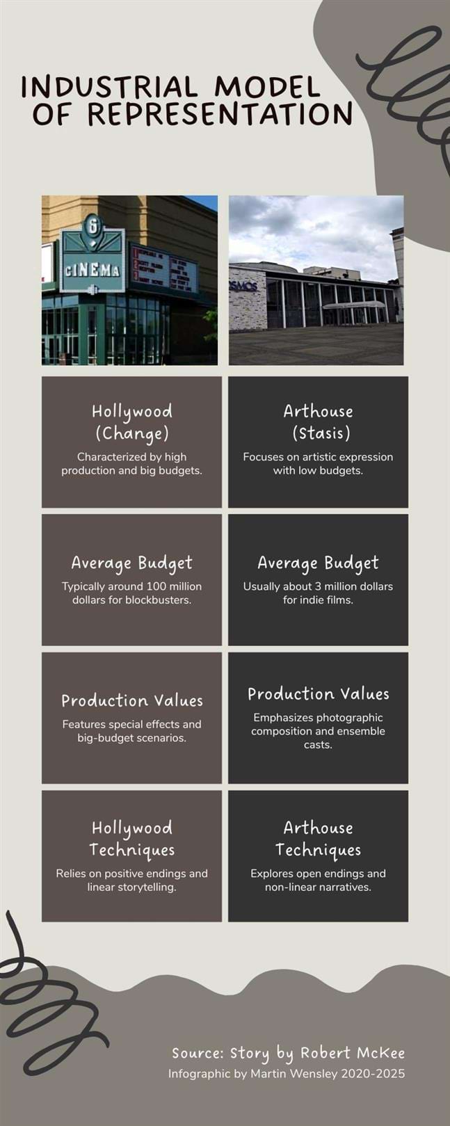
Hollywood (Change)
(Multiplex) Average Budget: 100 Million Dollars Hollywood Production Values
Special Effects Star System Private Finance Guns for Hire Hollywood Techniques
Positive Endings Cliched/Forced Action External Conflict Classical Form Consistent Reality Causality Linear Time |
Arthouse (Stasis)
(Cine Palace) Average Budget: 3 Million Dollars Arthouse Production Values
Photographic Composition Ensemble Acting Government Grants Auteurs Arthouse Techniques
Open Endings Internalized Passivity Inner Conflict Sensory Stimulation Inconsistent Realities Coincidence Non-linear Time |
Now let’s talk about practical application. Each visual element has its moment to shine:
Area Charts:
-
WHEN TO USE: When showing cumulative totals or parts of a whole over time
BEST FOR: Market share evolution, budget allocation changes, audience growth
PRO TIP: Maintain consistent scale and consider using transparency to show overlapping areas
Bar Charts:
-
WHEN TO USE: For comparing discrete categories or showing rankings
BEST FOR: Sales by region, survey results, performance comparisons
PRO TIP: Always start your axis at zero to avoid misleading proportions
Histograms:
-
WHEN TO USE: For showing frequency distributions within continuous data
BEST FOR: Age demographics, price point analysis, time-based frequency
PRO TIP: Choose appropriate bin sizes to reveal meaningful patterns
Line Graphs:
-
WHEN TO USE: For tracking changes over continuous time or showing relationships
BEST FOR: Stock prices, temperature fluctuations, trend analysis
PRO TIP: Limit to 3-4 lines per graph before complexity overwhelms clarity
Timelines:
-
WHEN TO USE: For chronological storytelling or historical context
BEST FOR: Company history, project phases, evolutionary developments
PRO TIP: Use consistent spacing for equal periods
Icons:
-
WHEN TO USE: To create instant recognition or represent concepts
BEST FOR: Process steps, category identifiers, quick visual cues
PRO TIP: Stick to universally understood symbols unless targeting a niche audience
COLOR PSYCHOLOGY: THE EMOTIONAL UNDERCURRENT OF AN INFOGRAPHIC
Let’s talk about color, not just as a design elements, but as psychological triggers that can make or break your infographic’s effectiveness.
Color isn’t just decoration. It’s information. It’s emotional coding. It’s a hierarchy. And for too many designers, it’s an afterthought.
Consider these research-backed insights:
-
Blue inspires trust. Financial and healthcare infographics perform measurably better with blue color schemes. The association with stability and reliability is so strong that a University of British Columbia study found participants were 15% more likely to believe data presented with blue visual elements than identical data in red.
Red demands attention. Red creates urgency and draws immediate focus. Use it sparingly for warnings, critical data points, or calls to action. A Pantone Color Institute study found red elements were noticed 12% faster than any other color in data visualizations.
Green signals growth and positivity. Green naturally communicates progress, sustainability, and positive outcomes. It’s no accident that stock market gains are universally shown in green while losses appear in red.
Yellow activates caution and optimism. Yellow commands attention without triggering the alarm response of red. It’s ideal for highlighting important but non-critical information.
Gray recedes. Use gray for background elements, secondary data, or grid lines that should be present but not competing for attention.
The most sophisticated infographics use color as a semantic layer—consistent meaning is assigned to each hue. Revenue always appears in one color, and costs in another. Growth trends use a specific palette while declining metrics use another. This visual consistency creates an intuitive language that speeds comprehension.
But here’s where most designers fail: They don’t account for color accessibility. Approximately 8% of men have some form of color vision deficiency. That means nearly one in twelve viewers might misinterpret your carefully chosen palette.
Always test your infographics with color blindness simulators. Tools like Coblis or Adobe Photoshop’s color blindness preview let you see your design through different visual perspectives. When in doubt, use both color and pattern or shape to differentiate important elements.
CITING SOURCES: THE CREDIBILITY GAME

Your infographic is only as trustworthy as its sources. Here’s how to cite properly:
-
Primary Source Attribution: Include a dedicated “Sources” section at the bottom of your infographic. Keep it small (8-10 pt font is fine) but legible.
Direct Data Labeling: For particularly important or potentially controversial statistics, include a miniature citation directly beside the data point (e.g., “42% increase in conversion rates [Harvard Business Review, 2024]").
QR Code Integration: For space-limited infographics, consider adding a QR code linking to a full reference page.
Date Stamping: Always include when the data was collected/published. Information ages quickly.
Methodology Mention: A brief note about how the data was gathered adds substantial credibility.
Let’s address the elephant in the room: Most infographics have abysmal citation practices. We’ve normalized the habit of throwing around statistics without proper attribution. This isn’t just sloppy—it’s dangerous. In an era of widespread misinformation, proper sourcing isn’t optional—it’s an ethical imperative.
Consider this scenario: You create a stunning infographic about climate change that goes viral. Thousands share it. But you based it on outdated or cherry-picked data without clear citations. You’ve now contributed to the public misunderstanding of a crucial issue. That’s not communication—that’s pollution.
A smart citation doesn’t have to be visually disruptive. Bloomberg’s data visualizations masterfully integrate source information into their design language. The New York Times embeds methodological notes within expandable sections. FiveThirtyEight maintains meticulous sourcing while preserving clean design.
Remember: Data without sources is just creative writing. And in today’s skeptical world, credibility isn’t optional—it’s essential. Your most beautiful infographic is worthless if nobody trusts it.
THE FINAL WORD
An infographic isn’t just something you create—it’s something you engineer. It’s equal parts science, psychology, design, and storytelling.
When you nail it, your audience doesn’t just see information—they absorb it. They don’t just read data—they experience it. And most importantly, they remember it long after they’ve scrolled past.
The most dangerous mistake is thinking of infographics as mere illustrations accompanying your “real” content. In our overwhelmed digital world, your infographic often IS your content. For many viewers, it’s the only part they’ll actually consume. Treat it with that level of importance.
Let me leave you with a framework I call the “Three R’s of Infographic Excellence":
-
Every element must serve your core message. Even the most beautiful visual fails if it doesn’t advance understanding.
Great infographics create an emotional connection. They don’t just inform—they make you care about the information.
Remarkable. In a sea of mediocre content, create something worth remarking on. Something distinctive. Something that stops the scroll.
In a world drowning in information but starving for insight, a well-crafted infographic isn’t just good communication.
It’s power.
Now go make something brilliant.
Sources: 1 Wikipedia, 2 Tufte, Edward R. (1982). The Visual Display of Quantitative Information. Cheshire, CT: Graphics Press.
Photo Credit: Fred Romero
© Martin Wensley, 2020-2025 — Industrial Model of Representation: Infographic Guide

